Throughout life, I've always been irregularly good at one thing, hating. I usually tend to keep this out of my blog, but these takes were obviously far too important to not share with my loyal 0.5 readers. I've been working on recreational websites for a little over a month and a half now, and whilst I have learned what I like in designing websites, I also learned a lot about what bothers me in web design, in other words, pet peeves. The former is boring, and as aforementioned, I'm a professional hater, so this'll be about the latter.
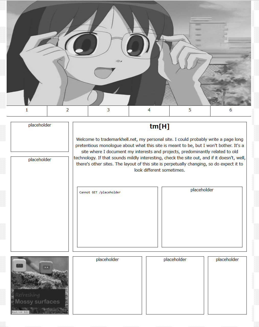
I certainly could've introduced the talking points of this article in the first paragraph, but that would almost make this too structured, and structure almost implies that I have valid criticisms, which I don't. So I'll start off here, I have always been irrationally bothered by absurdly large headers, I actually tried using one on this (questionable) webdev attempt:

I'm a firm believer in substance over style, and this carries over to my current web design philosophy. By having a header which takes up a great deal of screen real estate, you're effectively reducing the functionality your site has prior to scrolling. This is exactly why I believe headers should be small relative to the main content area, for you can use the content to express yourself and add value to your site, as opposed to adding a silly image. Once more, these are all just my unfounded opinions, don't take them too seriously, unless you agree with them, in which case they're completely evidence backed and real.
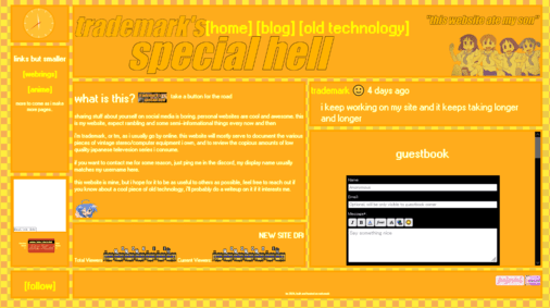
Continuing on the trend of web design pet peeves I've picked up through personal failure, I'll be going over one of the greatest accessibility warcrimes, sites that expand horizontally as opposed to vertically. Just about any monitor of any size can handle a 900px wide site that goes down, but very few monitors can handle a 600px tall site that expands horizontally. Just because it works on your 1440p monitor doesn't mean everyone else should have to use a horizontal scrollbar. I speak from experience:

As you can see, this is a site largely based on a horizontal layout, which whilst semi-cool looking, resulted in the majority of mobile or laptop users having a less than pleasant experience. This largely loops back to my previous point of substance over style, by making your site vertically built, it may lose some style points, but it gains a great deal of substance in the form of accessibility.
Now, these previous two points almost had too much backing evidence, so I feel it's my duty to highlight one of my completely irrational pet peeves, sites with a bunch of gifs and images. I literally have no reason for disliking them, they look cool, but for some reason part of me takes this way too seriously and thinks people should cover their sites in their schizo ramblings instead of photos or whatever. Don't take this as advice from me, it sucks the soul out of your website, I mean, just look at mine.
Take this article as inspiration if you want, but I'd highly advise not doing so. Web design is meant to be fun, do whatever the hell you want, I just wanted to write this for fun, as my form of web design fun is publishing my stupid ramblings. Have a good one, keep making cool sites, TM out.
copyright trademarkhell.net 2024-