About three weeks ago now, in the middle of July, I came to a sudden revelation, one, which, for a lesser man, may have caused great mental distress. I realized that my website completely sucked, was borderline impossible to modify, and was almost illegible. I, however, being the brave warrior that I am, chose not to let this decrease my morale, and instead set off on a brave journey to improve my site.
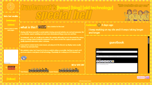
For context, allow me to present the website that I had at the time.

It's not bad... per se, especially given it was the product of me learning html the day before, but it's not good. It's very obviously the product of someone with little to no knowledge of compatability and the fundamentals of webdesign. I built content out horizontally instead overtically because I thought it looked cool, but that also meant that anyone with a monitor smaller than 1080p had to scroll to the side. I also had the brilliant idea of making the site yellow, orange, and white, which whilst pretty good for creamsicles, is god-awful for websites. Reading this site is a similar experience to trying to read grey text on a black background whilst wearing sunglasses. It was also built with no knowledge of flexbox, solely relying on CSS Grids, and no static site generator, so it was basically impossible for me to add more content to it.
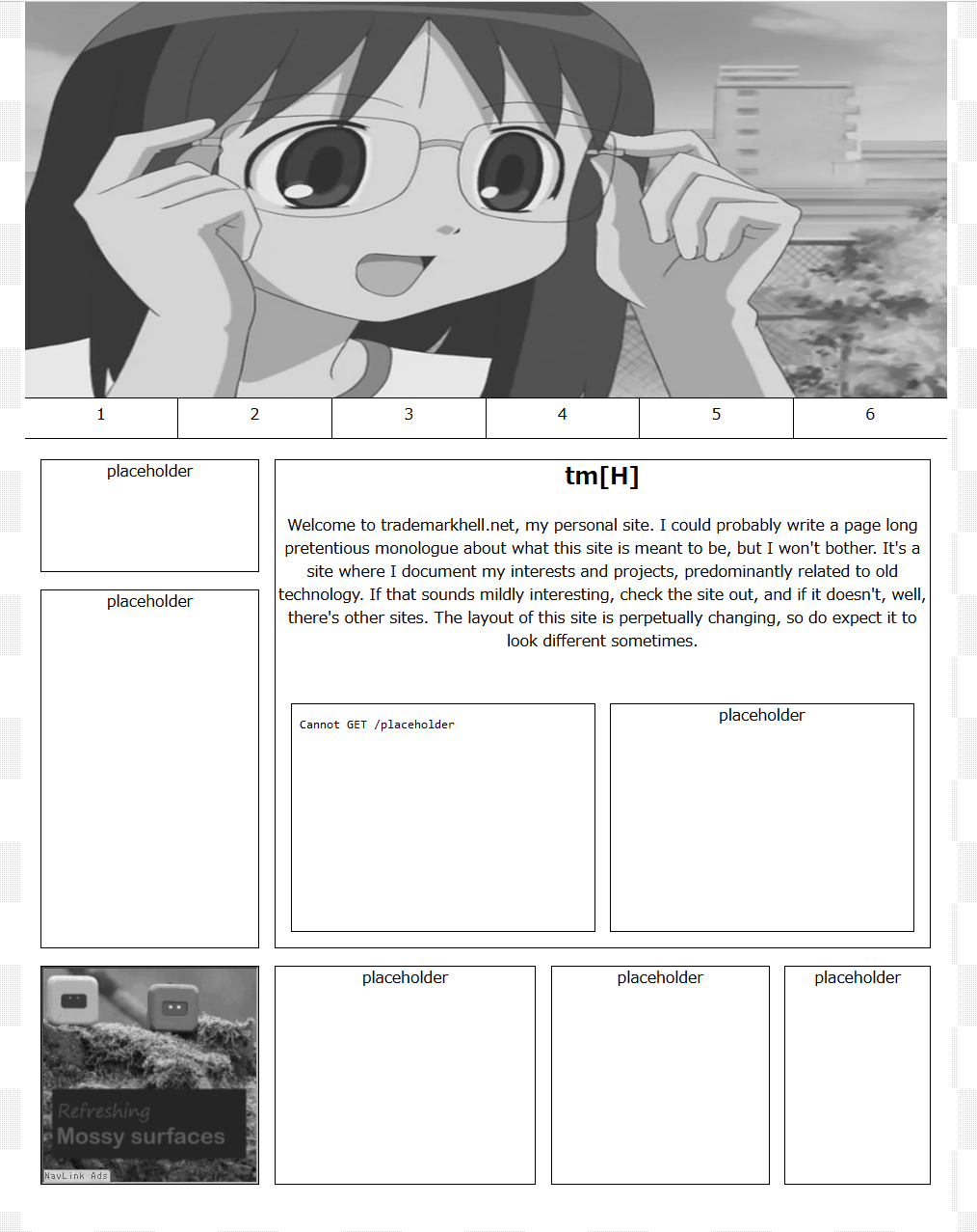
In a lot of ways, it was a fitting site for what it was, a site in it's infacy, and similar to infants, it was pretty useless. In an exercise of great stupidity, I thought that the best way to fix this was to suck any personality the site had out of it. I created a soulless husk of a website that was solely black and white, which had a layout that served no purpose outside of being utilitarian. Shockingly, a personal website that's meant to express your creativity that was made with no creativity isn't that appealing, here's a photo of it:

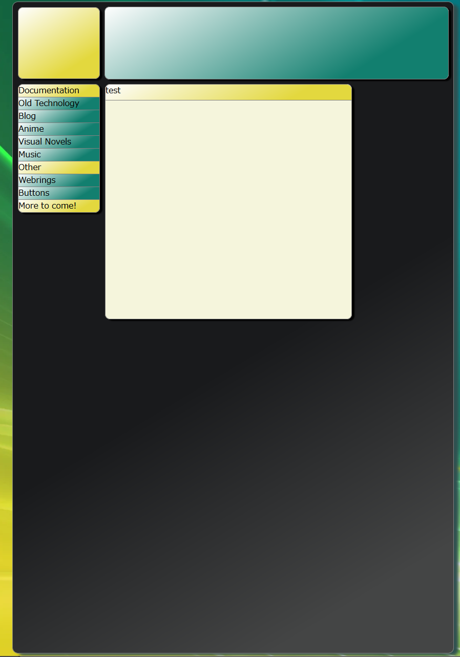
Thankfully, I quickly realized that Melankorin may be the only one actually able to make a visually appealing monochrome site, and quickly moved onto my next valiant attempt at webdesign, not yet feeling dejected (which I soon would be). For this layout, I thought, logically, if colorful backgrounds for text were too much, and if black and white was too boring, why not make the best of both worlds. This then led me to what may be the ultimate example of style over substance. It's cool, I won't deny that, but nothing really "clicked" for me with this site, it just, wasn't what I wanted. I admittedly don't have much to say about it, but here it is, even more unfinished than the last layout:

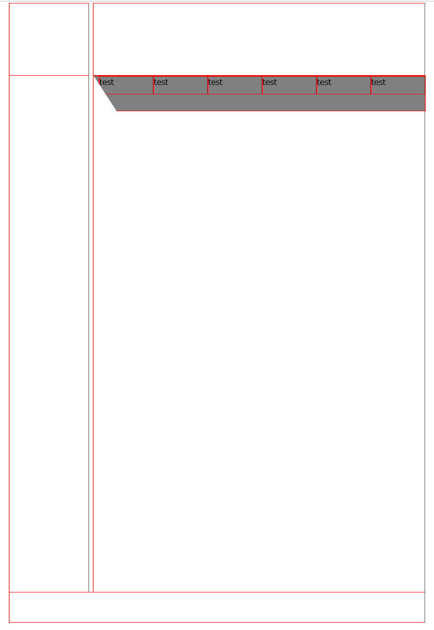
We're now stepping into the territory of layouts I have literally no memory of making, so this should be interesting. At this point I was so engrossed in making the perfect website, that I wasn't even drafting layouts on paper anymore, I was just making them and crossing my fingers, and this also meant that I was making even less progress before dropping them immediately. There was about four layouts I did this for, and quite frankly they're all so unfinished that I don't feel the need to attach more than one image, but, here it is, the pinnacle of modern webdesign (i honestly don't know what this was meant to be???):

At this point, I had more drafts of webdesigns on paper than I could count, thinking that if my previous attempts didn't work, I'd surely get a sudden revelation at some point, but, I never did, and so, I randomly picked a layout, and now that layout is the site you're on. I don't really "like" this layout, but, it meets the bare minimum of what I wanted. It has color, but not too much. It has visual elements, but not too many. It has various templates for webpages, but not too many. I'll redo this website eventually, but the issue is, I can't find anything wrong with this layout, I don't like it, but I don't know why.
This layout, in my eyes, is a failure, but to be fair, so were all the previous ones, I suspect webdesign for me will always be me chasing the high I think i'll get if I make a website I like, I don't know if that will ever happen, but I'm glad it probably won't, as it gives me a reason to keep working on websites, which others seem to like. Anyways, thanks for reading this ramble, my other posts should be more interesting, but I've wanted to write this one since my first failed layout.
copyright trademarkhell.net 2024-